Table of Contents: Overview Code structure Container settings * title * size * backdrop Layout * across * below * return * space * origin * at * pad * do Faces definition * Keywords * left * center * right * top * middle * bottom * bold * italic * underline * extra * data * draw * font * para * wrap * no-wrap * font-size * font-color * font-name * react * loose * all-over * hidden * disabled * Datatypes * Actors Panels * panel * group-box * tab-panel * Styling * style
Overview
VID stands for Visual Interface Dialect. Its purpose is to provide a simple dialect (DSL) for describing graphic user interfaces on top of the Red View engine.
VID allows you to specify each graphic component to display, giving the choice of different layout methods: horizontal or vertical flowing grid positioning * absolute positioning
VID will create a container face for you automatically, to hold the faces description you provide. By default, the container face is of type window.
VID code is processed by the layout function (which is internally called by view function). The VID code is then compiled to a tree of faces, suitable for direct display.
Note: use help view and help layout from Red's console to see how to process a VID block.
Code structure
Typical VID block of code has the following structure:
[
    <container settings>
    <layout description>
]
-
container settings: settings which affect the container object (could be a panel or a window).
-
layout description: layout positioning commands, style definitions and face descriptions.
Note: All sections are optional, there is no mandatory content that must be provided in a VID block.
Container settings
title
Syntax
title <text>

<text> : title text (string!).
Description
Sets the title text of the container face.
size
Syntax
size <value>

<value> : width and height in pixels (pair!).
Description
Sets the size of the container face. If the size is not explicitly provided, the container's size is automatically calculated to fit its content.
backdrop
Syntax
backdrop <color>

<color> : name or value of a color (word! tuple!).
Description
Sets the background color of the container face.
Layout
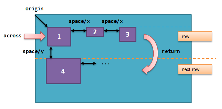
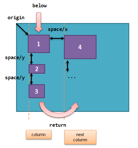
By default, VID places the faces in the container face according to simple rules:
- direction can be horizontal or vertical
- faces are positioned after each other in the current direction using the current spacing
Defaults:
origin: 10x10
space: 10x10
* direction: across
This is how faces are laid out in across mode:
This is how faces are laid out in below mode:
across
Syntax
across
Description
Sets the layout direction to horizontal, from left to right.
below
Syntax
below
Description
Sets the layout direction to vertical, from top to bottom.
return
Syntax
return
Description
Moves the position to the next row or column of faces, depending of the current layout direction.
space
Syntax
space <offset>

<offset> : new spacing value (pair!).
Description
Sets the new spacing offset which will be used for placement of following faces.
origin
Syntax
origin <offset>

<offset> : new origin value (pair!).
Description
Sets the new origin position, relative to container face.
at
Syntax
at <offset>

<offset> : position of next face (pair!).
Description
Places the next face at an absolute position. This positioning mode only affects the next following face, and does not change the layout flow position. So, the following faces, after the next one, will be placed again in the continuity of the previous ones in the layout flow.
pad
Syntax
pad <offset>

<offset> : relative offset (pair!).
Description
Modifies the layout current position by a relative offset. All the following faces on the same row (or column) are affected.
do
Syntax
do <body>

<body> : code to evaluate (block!).
Description
Evaluates a block of regular Red code, for last-minute initialization needs.
Faces definition
A face can be inserted in the layout, at the current position, by just using the name of an existing face type or one of the available styles.
Syntax
<name>: <type> <options>

<name>    : optional name for the new component (set-word!).
<type>    : a valid face type or style name (word!).
<options> : optional list of options.
If a name is provided, the word will reference the face! object created by VID from the face description.
Default values are provided for each face type or style, so a new face can be used without having to specify any option. When options are required, the following sections are describing the different types of accepted options:
- Keywords
- Datatypes
- Actors
All options can be specified in arbitrary order, following the face or style name. A new face name or a layout keyword marks the end of the options list for a given face.
Note: window cannot be used as a face type.
Keywords
left
Syntax
left
Description
Aligns the face's text to left side.
center
Syntax
center
Description
Centers the face's text.
right
Syntax
right
Description
Aligns the face's text to right side.
top
Syntax
top
Description
Vertically align the face's text to top.
middle
Syntax
middle
Description
Vertically align the face's text to middle.
bottom
Syntax
bottom
Description
Vertically align the face's text to bottom.
bold
Syntax
bold
Description
Sets the face's text style to bold.
italic
Syntax
italic
Description
Sets the face's text style to italic.
underline
Syntax
underline
Description
Sets the face's text style to underline.
extra
Syntax
extra <value>

<value> : any value (any-type!).
Description
Sets the face's extra facet to a new value.
data
Syntax
data <list>

<list> : list of items (block!).
Description
Sets the face's data facet to a list of values. Format of the list depends on the face type requirements.
draw
Syntax
draw <commands>

<commands> : list commands (block!).
Description
Sets the face's draw facet to a list of Draw dialect commands. See Draw dialect documentation for valid commands.
font
Syntax
font <spec>

<spec> : a valid font specification (block! object! word!).
Description
Sets the face's font facet to a new font! object. Font! object is described here.
Note: It possible to use font along with other font-related settings, VID will merge them together, giving priority to the last one specified.
para
Syntax
para <spec>

<spec> : a valid para specification (block! object! word!).
Description
Sets the face's para facet to a new para! object. Para! object is described here.
Note: It possible to use para along with other para-related settings, VID will merge them together, giving priority to the last one specified.
wrap
Syntax
wrap
Description
Wrap the face's text when displaying.
no-wrap
Syntax
no-wrap
Description
Avoid wrapping the face's text when displaying.
font-size
Syntax
font-size <pt>

<pt> : font size in points (integer! word!).
Description
Sets the current font size for the face's text.
font-color
Syntax
font-color <value>

<value> : color of the font (tuple! word!).
Description
Sets the current font color for the face's text.
font-name
Syntax
font-name <name>

<name> : valid name of an available font (string! word!).
Description
Sets the current font name for the face's text.
react
This keyword can be used both as a face option or as a global keyword. Arbitrary number of react instances can be used.
Syntax
react [<body>]

<body> : regular Red code (block!).
Description
Creates a new reactor from the body block. When react is used as a face option, the body can refer to the current face using face word. When react is used globally, target faces need to be accessed using a name.
Note: Reactors are part of the reactive programming support in View, which documentation is pending. In a nutshell, the body block can describe one or more relations between faces properties using paths. Set-path setting a face property are processed as target of the reactor (the face to update), while path accessing a face property are processed as source of the reactor (a change on a source triggers a refresh of the reactor's code).
loose
Syntax
loose
Description
Enables dragging of the face using the left mouse button.
all-over
Syntax
all-over
Description
Sets the face all-over flag, allowing all mouse over events to be received.
hidden
Syntax
hidden
Description
Makes the face invisible by default.
disabled
Syntax
disabled
Description
Disables the face by default (the face will not process any event until it is enabled).
Datatypes
In addition to keywords, it is allowed to pass settings to faces using literal values of following types:
| Datatype | Purpose |
|---|---|
| integer! | Specifies the width of the face. For panels, indicates the number of row or columns for the layout, depending on the current direction. |
| pair! | Specifies the width and height of the face. |
| tuple! | Specifies the color of the face's background (where applicable). |
| string! | Specifies the text to be displayed by the face. |
| percent! | Sets the data facet (useful for progress and slider types). |
| image! | Sets the image to be displayed as face's background (where applicable). |
| url! | Loads the resource pointed to by the URL, then process the resource according to its loaded type. |
| block! | Sets the action for the default event of the face. For panels, specifies their content. |
| char! | (reserved for future use). |
Actors
An actor can be hooked to a face by specifying a literal block value or an actor name followed by a block value.
Syntax
<actor>
on-<event> <actor>

<actor> : actor's body block (block!).
<event> : valid event name (word!).
Description
It is possible to specify actors in a simplified way by providing just the body block of the actor, the spec block being implicit. The actor function gets constructed then and added to the face's actor facet. Several actors can be specified that way.
The created actor function full specification is:
func [face [object!] event [event! none!]][...body...]
The valid list of event names can be found here.
When a block is passed without any actor name prefix, the default actor for the face type is created according to the definitions here.
Panels
It is possible to define child panels for grouping faces together, and eventually applying specific styles. The size of the new panel, if not specified explicitly, is automatically calculated to fit its content.
The panel-class face types from View are supported in VID with a specific syntax:
panel
Syntax
panel <options> [<content>]

<options> : optional list of settings for the panel.
<content> : panel's VID content description (block!).
Description
Constructs a child panel inside the current container, where the content is another VID block. In addition to other face options, an integer divider option can be provided, setting a grid-mode layout:
- if the direction is across, divider represents number of columns.
- if the direction is below, divider represents number of rows.
group-box
Syntax
group-box <divider> <options> [<body>]

<divider> : optional number of row or columns (integer!).
<options> : optional list of settings for the panel.
<body>    : panel's VID content description (block!).
Description
Constructs a child group-box panel inside the current container, where the content is another VID block. A divider argument can be provided, setting a grid-mode layout:
if the direction is across, divider represents number of columns.
if the direction is below, divider represents number of rows.
Note: Providing a string! value as option will set the group-box title text.
tab-panel
Syntax
tab-panel <options> [<name> <body>...]

<options> : optional list of settings for the panel.
<name>    : a tab's title (string!).
<body>    : a tab's content as VID description (block!).
Description
Constructs a tab-panel panel inside the current container. The spec block must contain a pair of name and content description for each tab. Each tab's content body is a new child panel face, acting as any other panels.
Styling
style
Syntax
style <new> <old> <options>

<new>     : name of new style (set-word!).
<old>     : name of old style (word!).
<options> : optional list of settings for the new style.
Description
Sets a new style in the current panel. The new style can be created from existing face types or from other styles. The new style is valid only in the current panel and child panels.
Styles can be cascaded from parent panels to child panels, so that the same style name can be redefined or extended in child panels without affecting the definitions in parent panels.